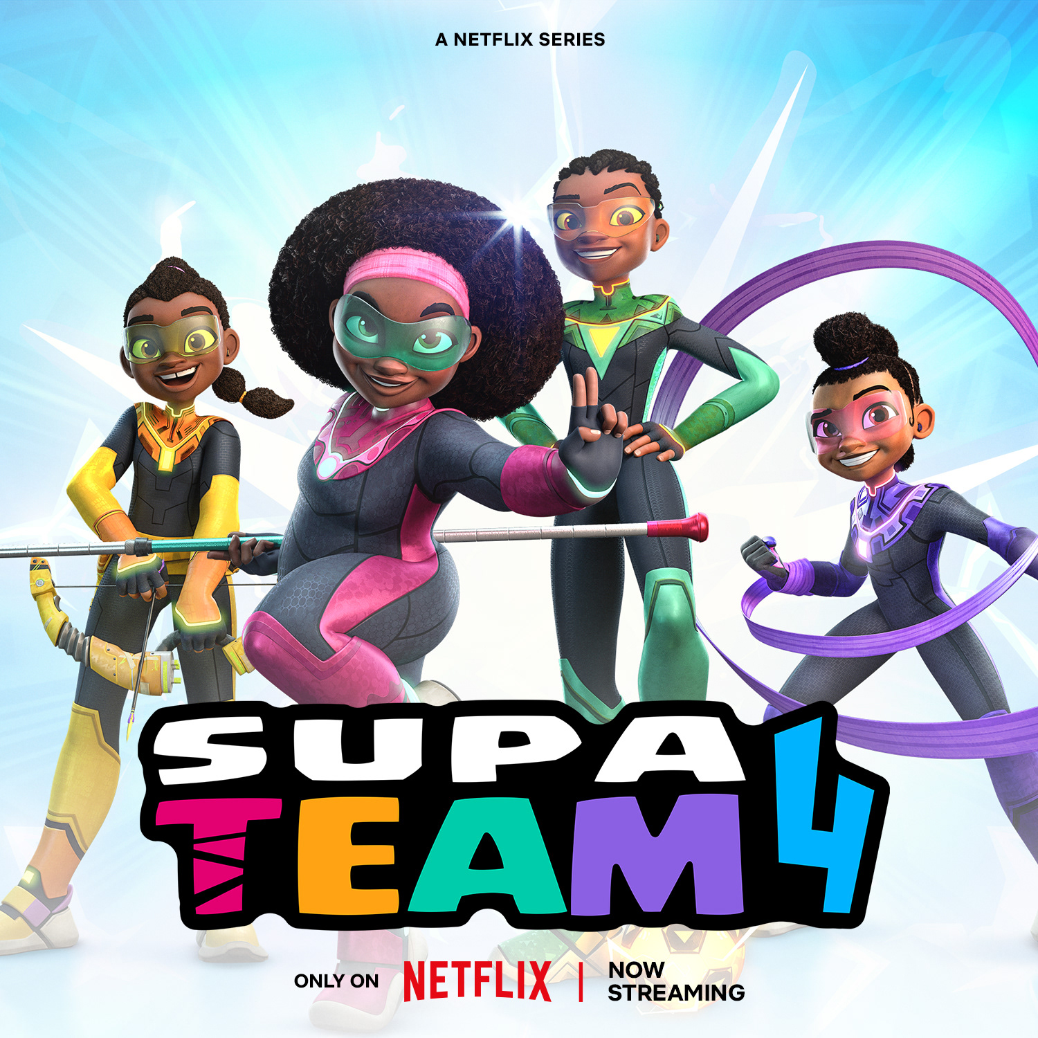
In addition to that, it's been nominated at the British Animation Awards as Best International TV Series.
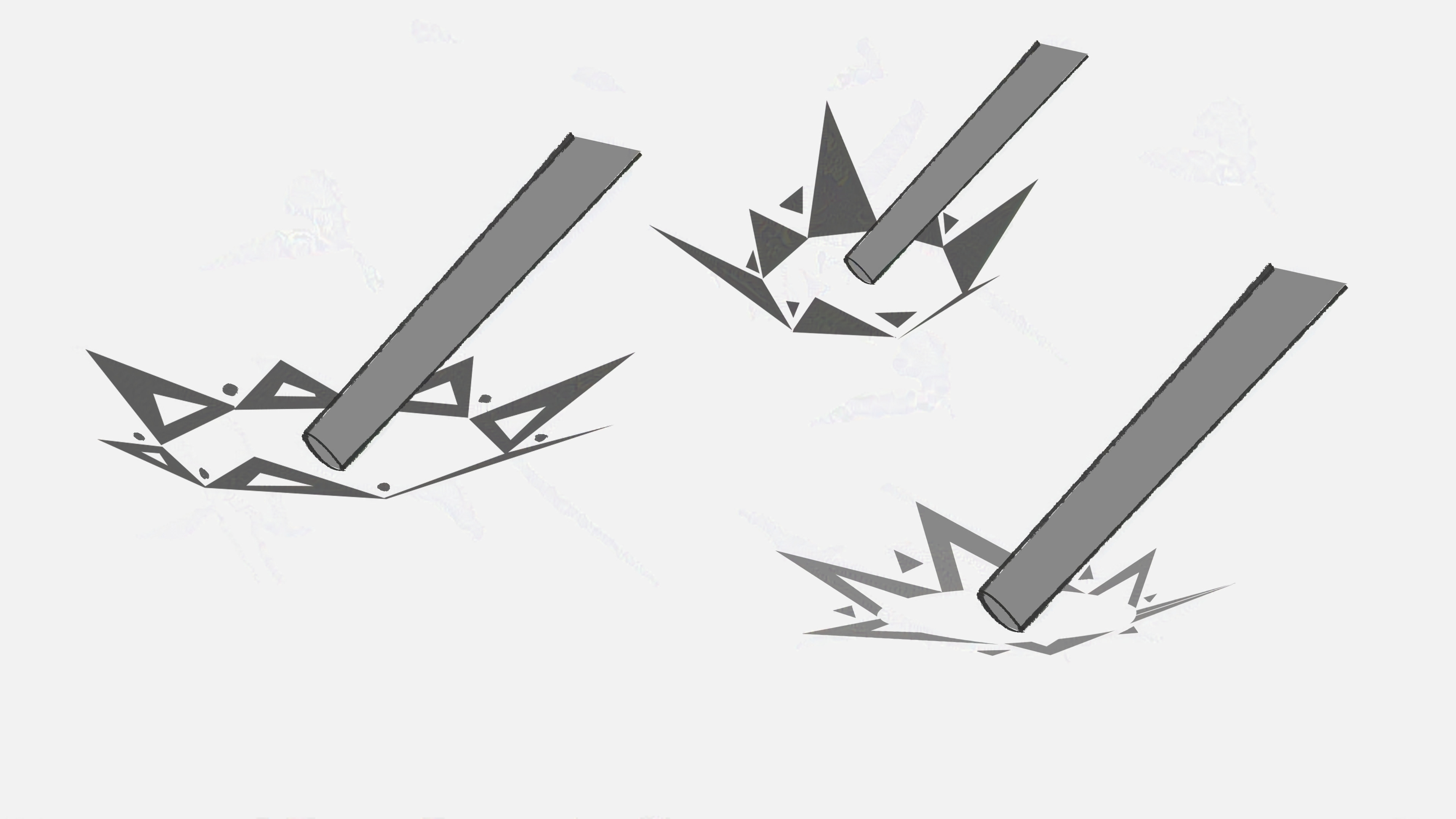
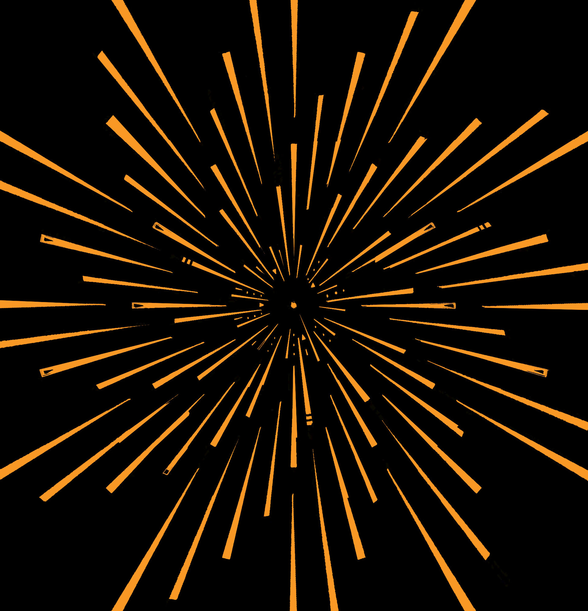
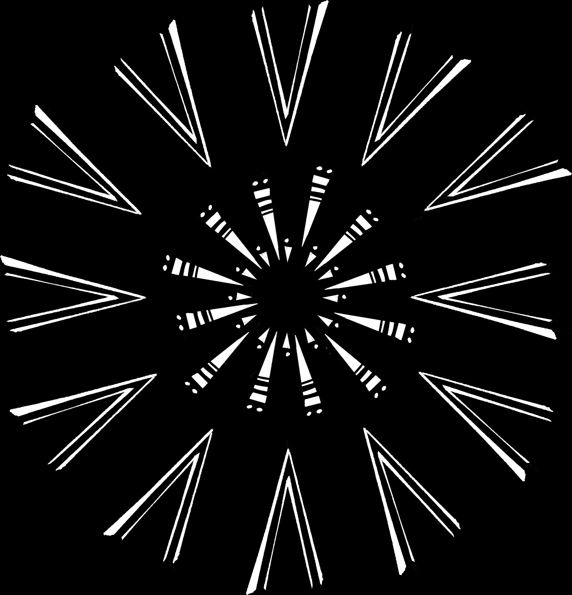
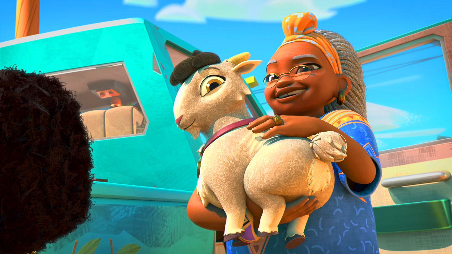
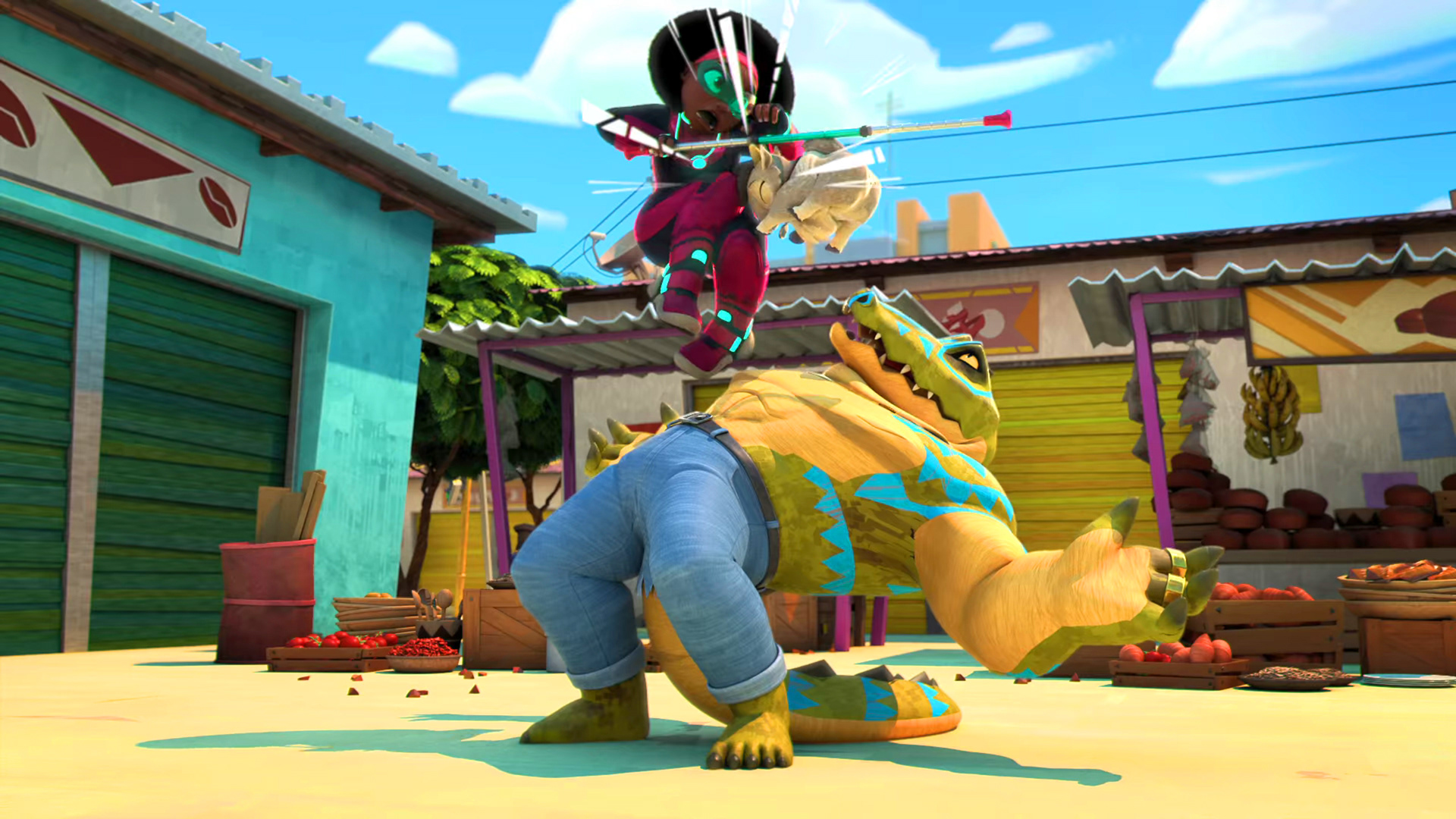
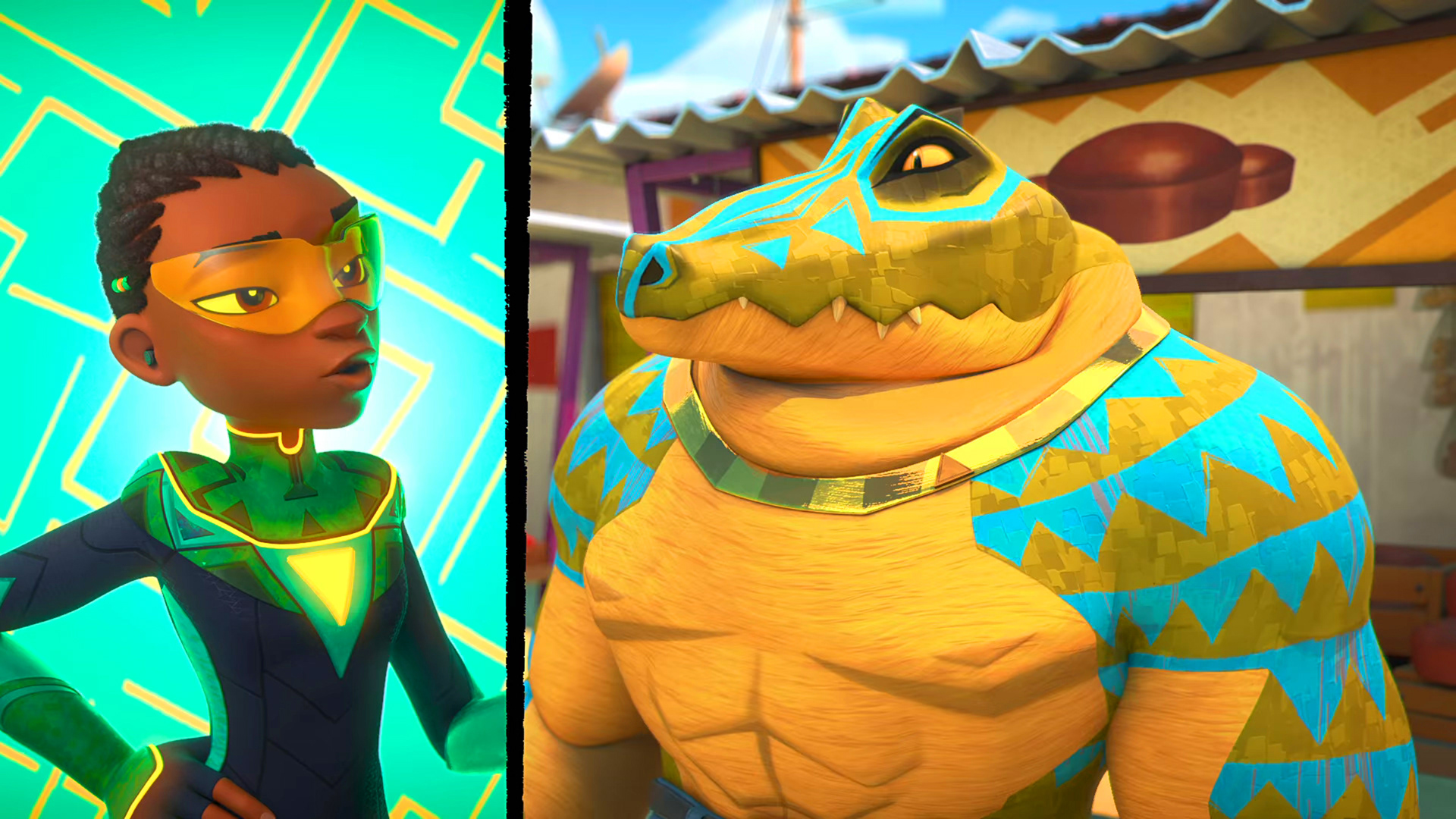
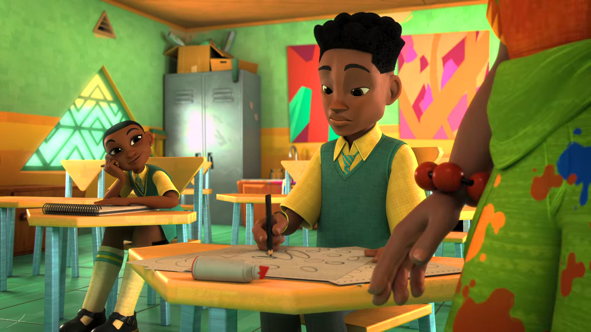
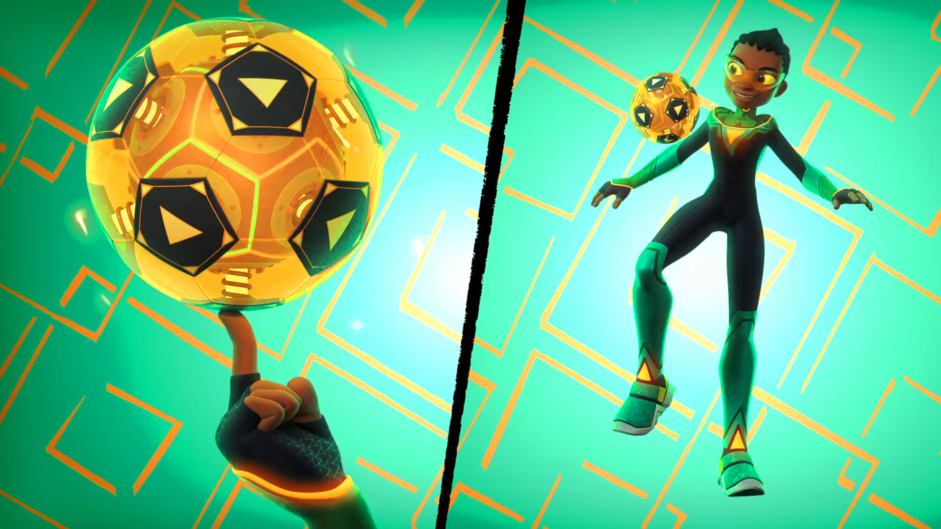
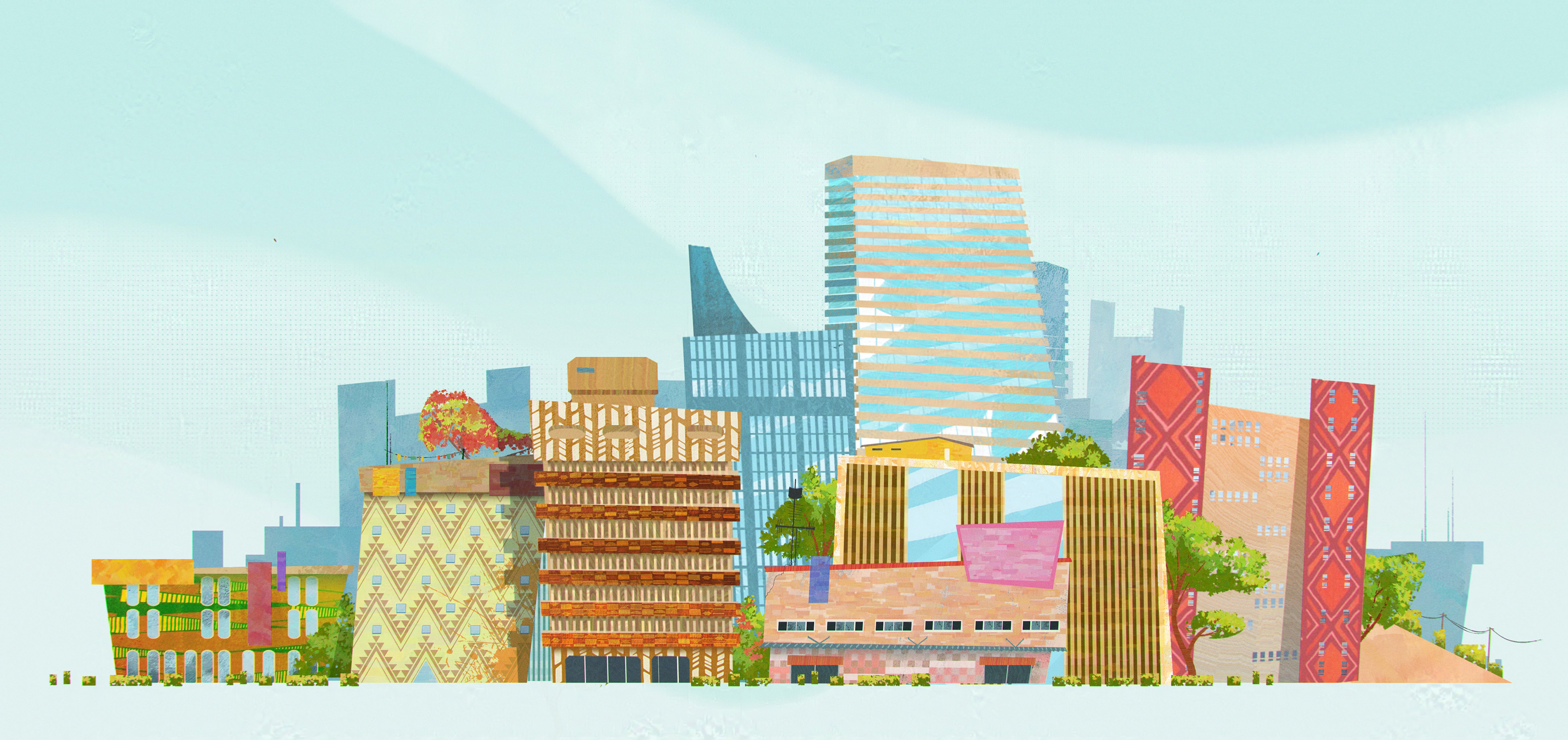
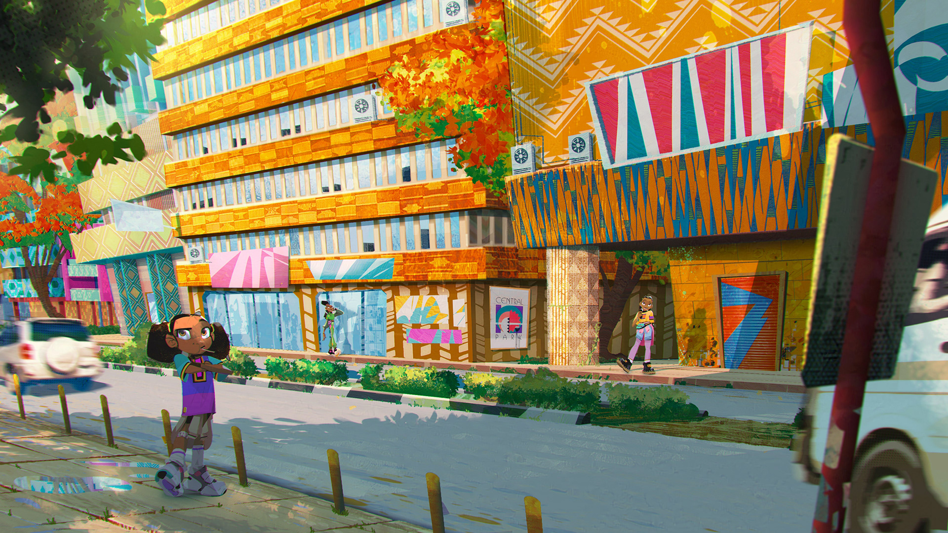
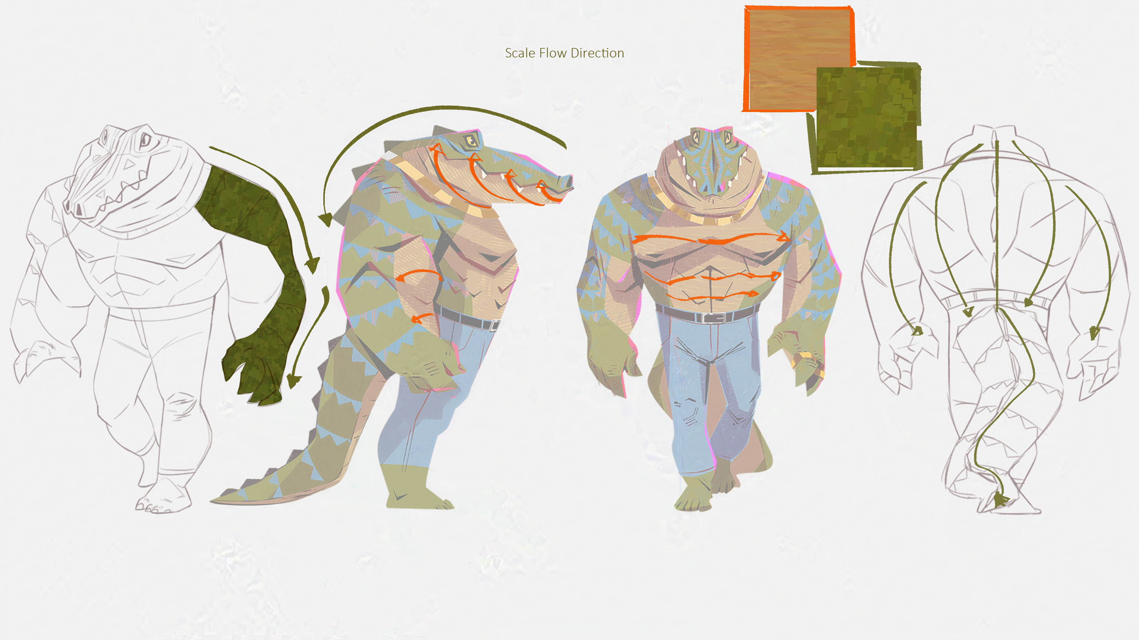
With this post I just wanted to show the care in every details you see on Supa Team 4. It was decided at a early stage to emphasize the use of simple geometric forms to describe the world and the girls and echo African styles. I came up with the idea of identifying the girls with the most simple but recognizable shapes: circle/M-Kozo, square/T-Mlilo, rectangle/K-Bongo, triangle/Za-Mpezi. From there, everything was finely art directed so that the entire world could be affected by the same principle. From impact shapes, fine surfacing details, big pattern backgrounds for each girl-Mama K-Villains, VFX shapes, the windows in the city buildings, the city itself, characters' eyes, basically everything that went on screen was scrutinized. Even Chomps' bum was "finely" detailed (spent a day researching goats' bums with the series director Dave Osborne, that day scarred us for life XD)
The art team I worked with, supported by an amazing production team (special mention to Inge Faber, Heidi Karin Madsen!!), have a special place in my heart, they helped define something that was so complex and made sure things were genuine. And although this was hard work, we also had a lot of fun!
I hope you enjoy this selection of images, they show the amount of love and dedication we all put into this brand new animated TV Series.
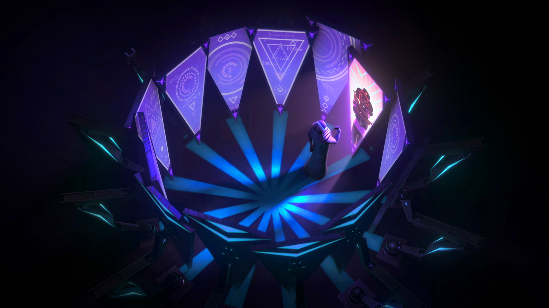
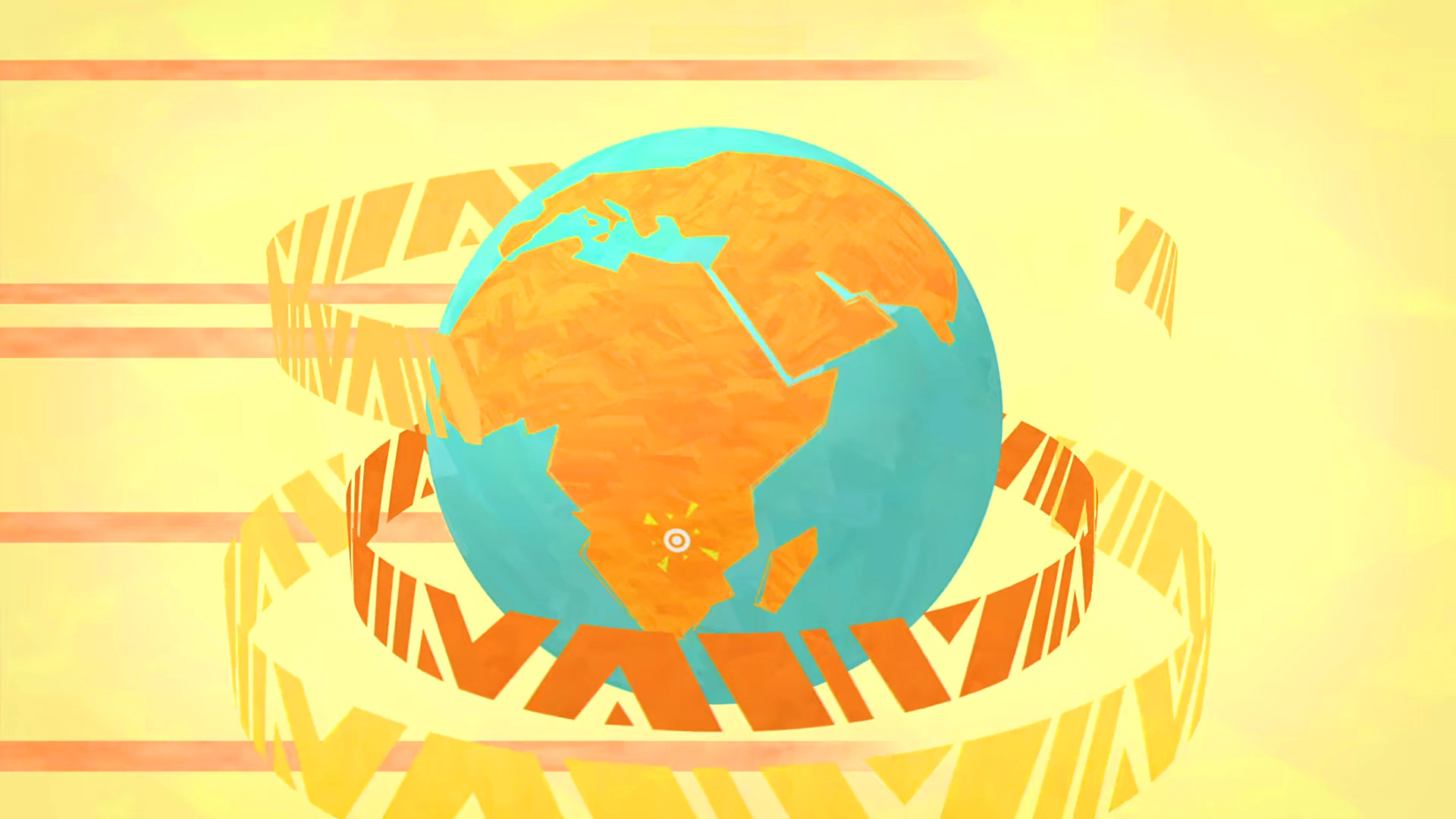
Hundreds of images were created for the show, this is just a tiny part of it.
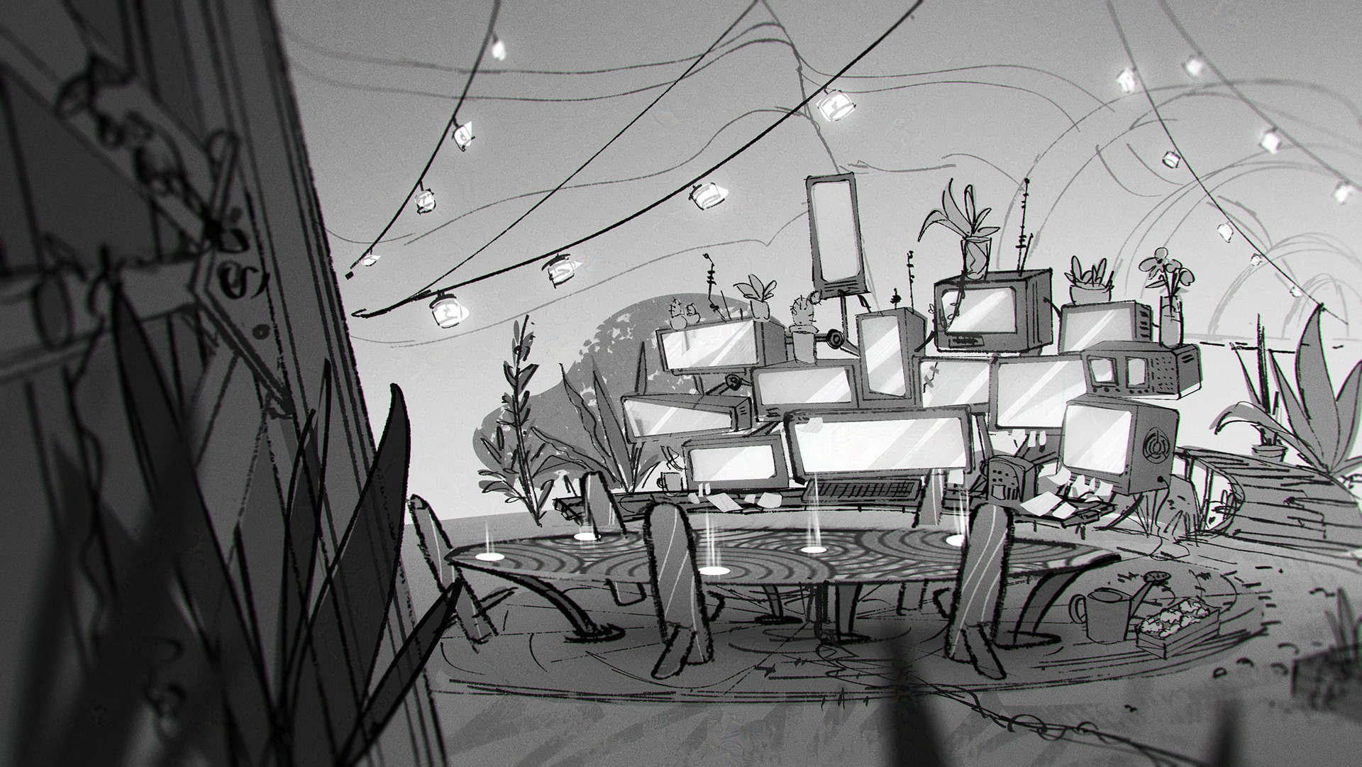
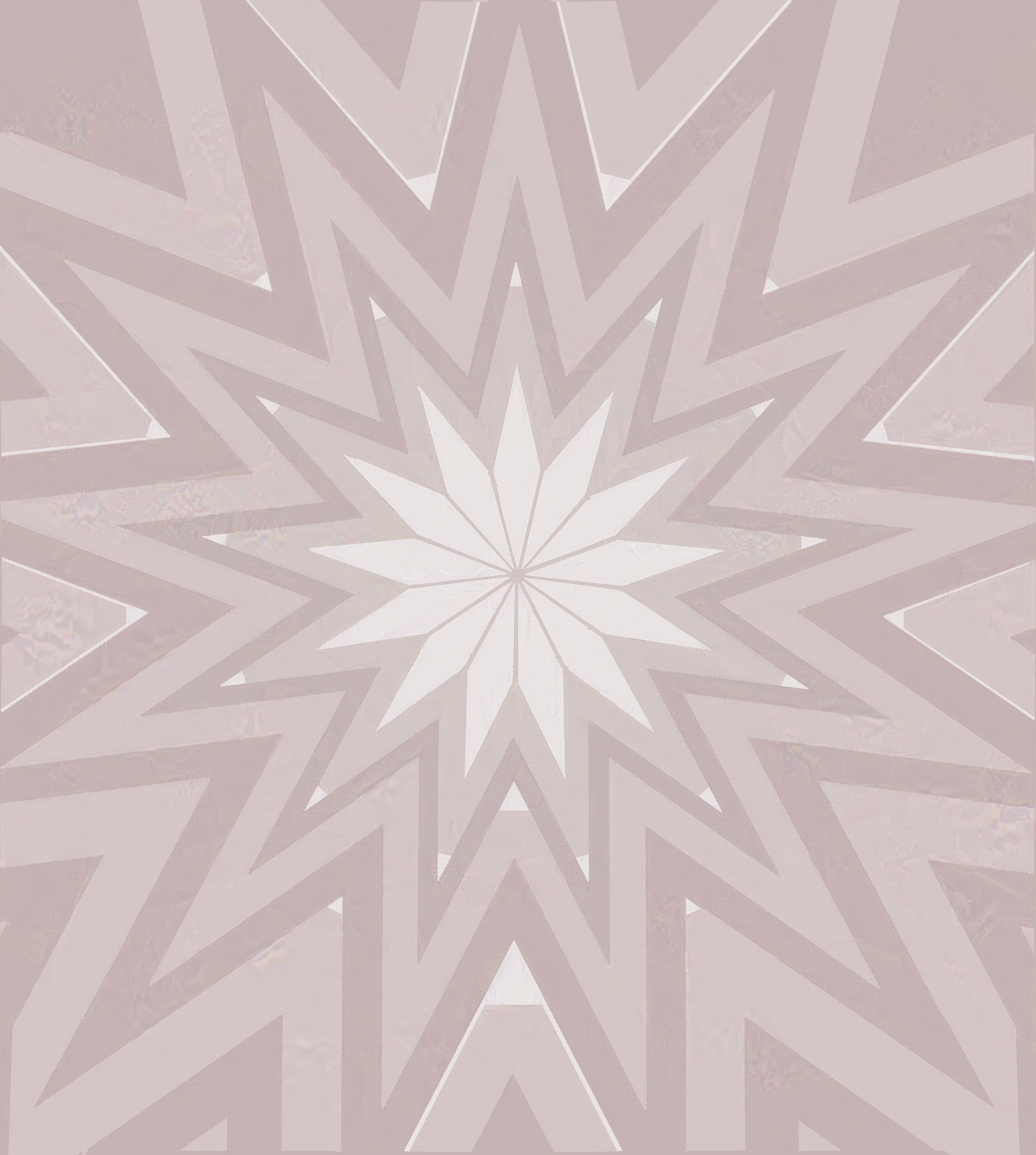
This is one of the very fist images created for the show! It all started here...
Following up with this image. At the very beginning I tried to create images that were very busy, full of colours and patterns. Slowly as a style started to emerge the look organically changed to what you can see now on Netflix. Characters by Malcolm Wope.
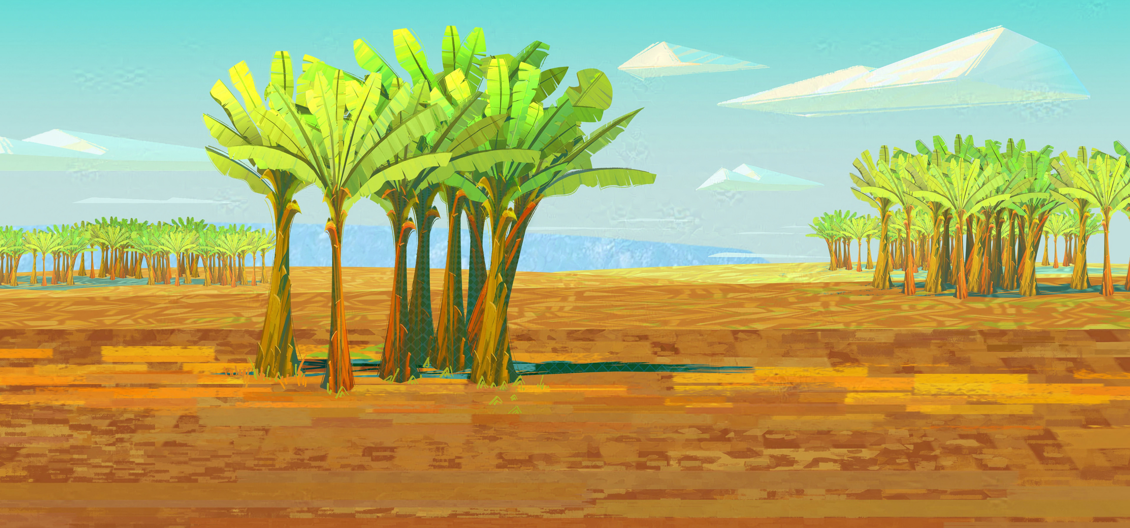
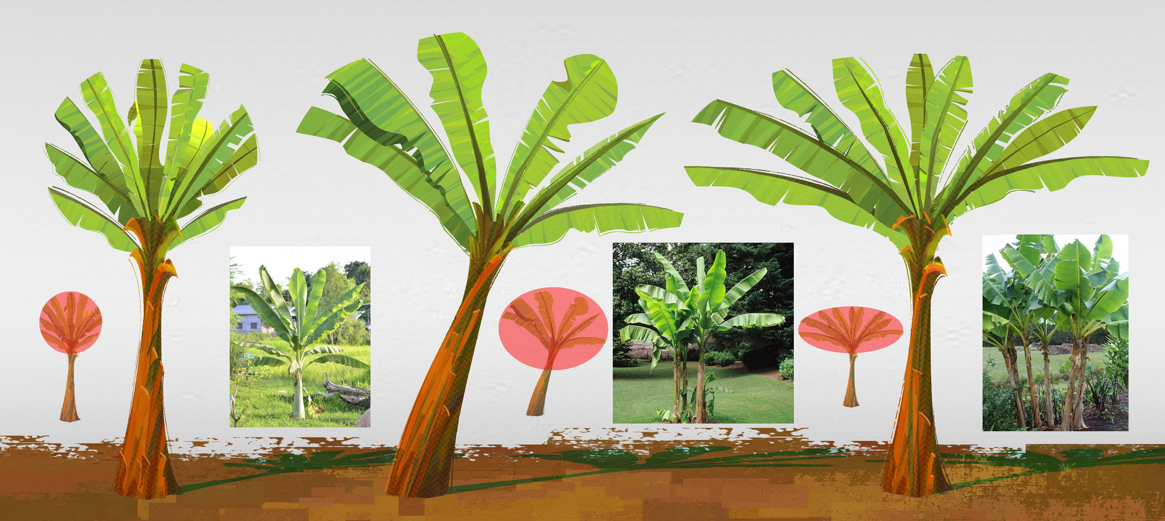
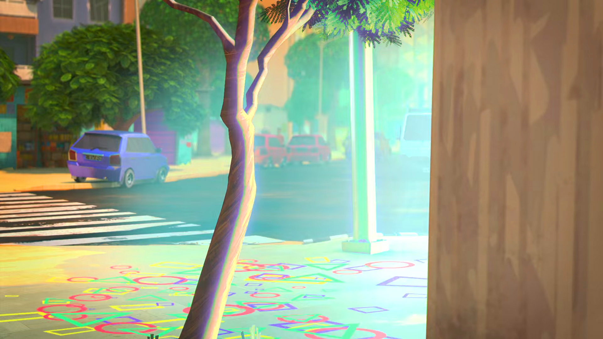
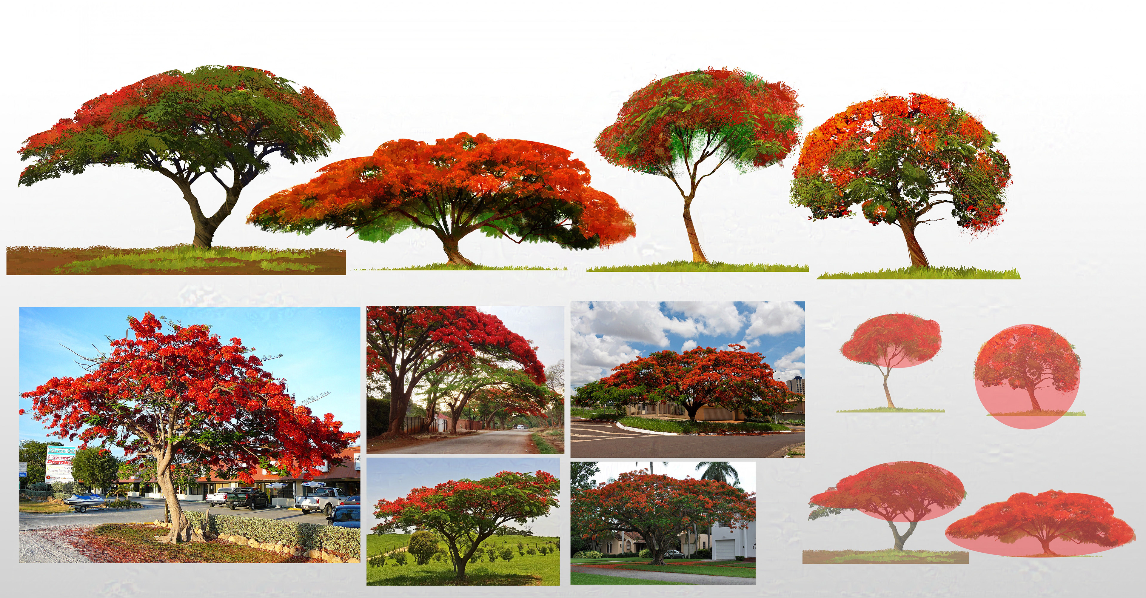
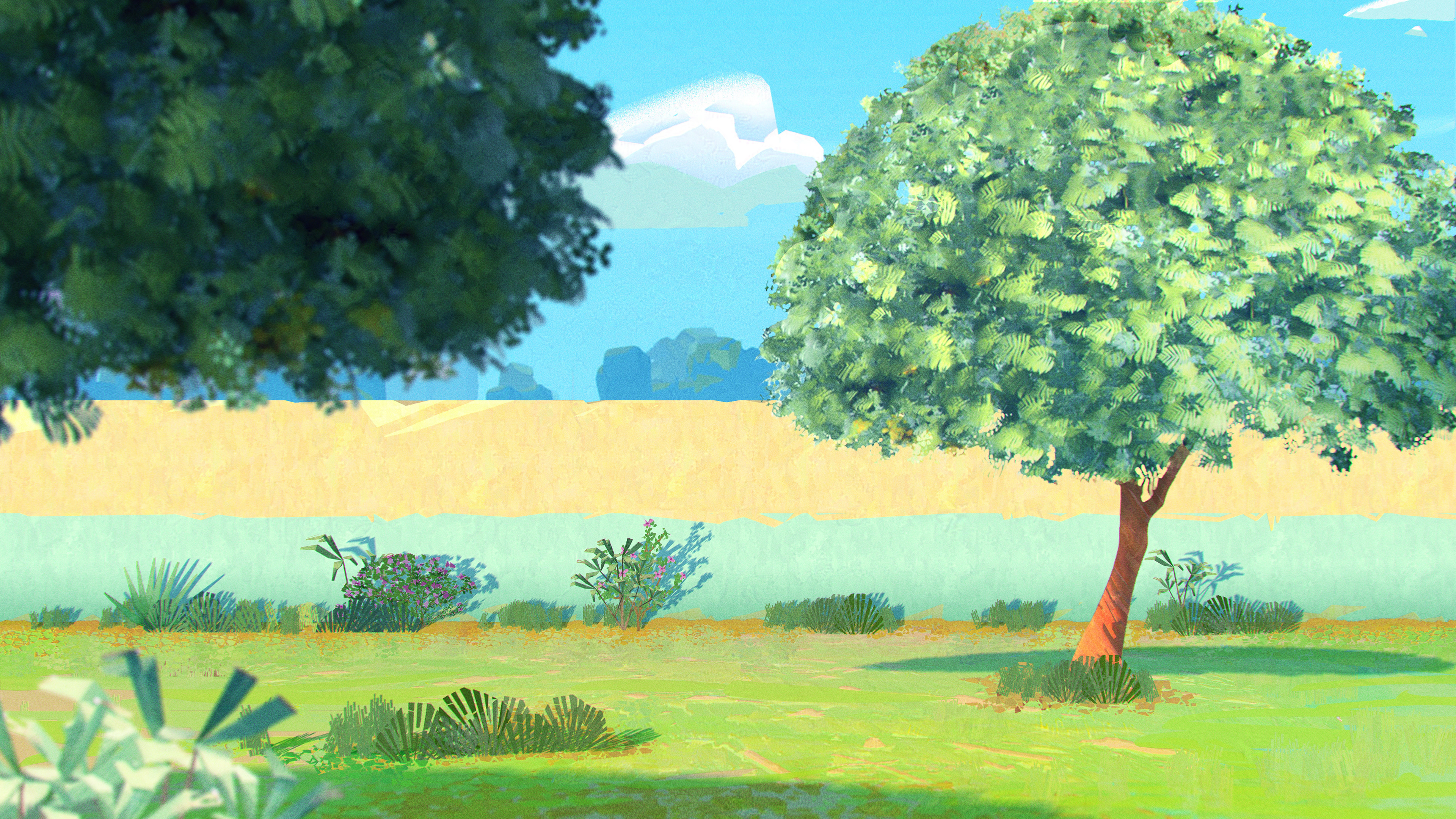
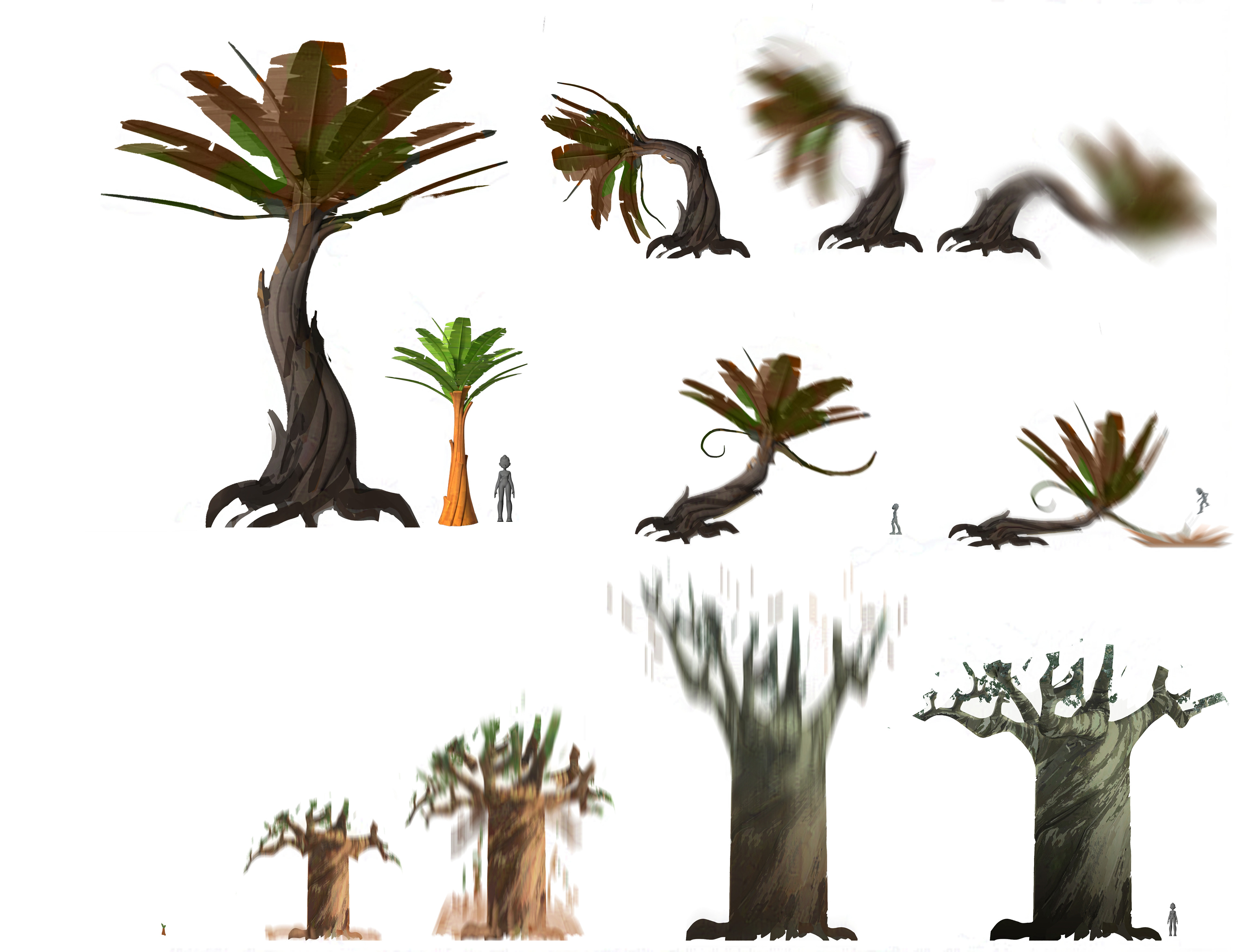
It was very important to me that every objects in the show was related to a geometric form. In this example it's possible to se how the palm leaves are enclosed into circular or elliptical shapes.
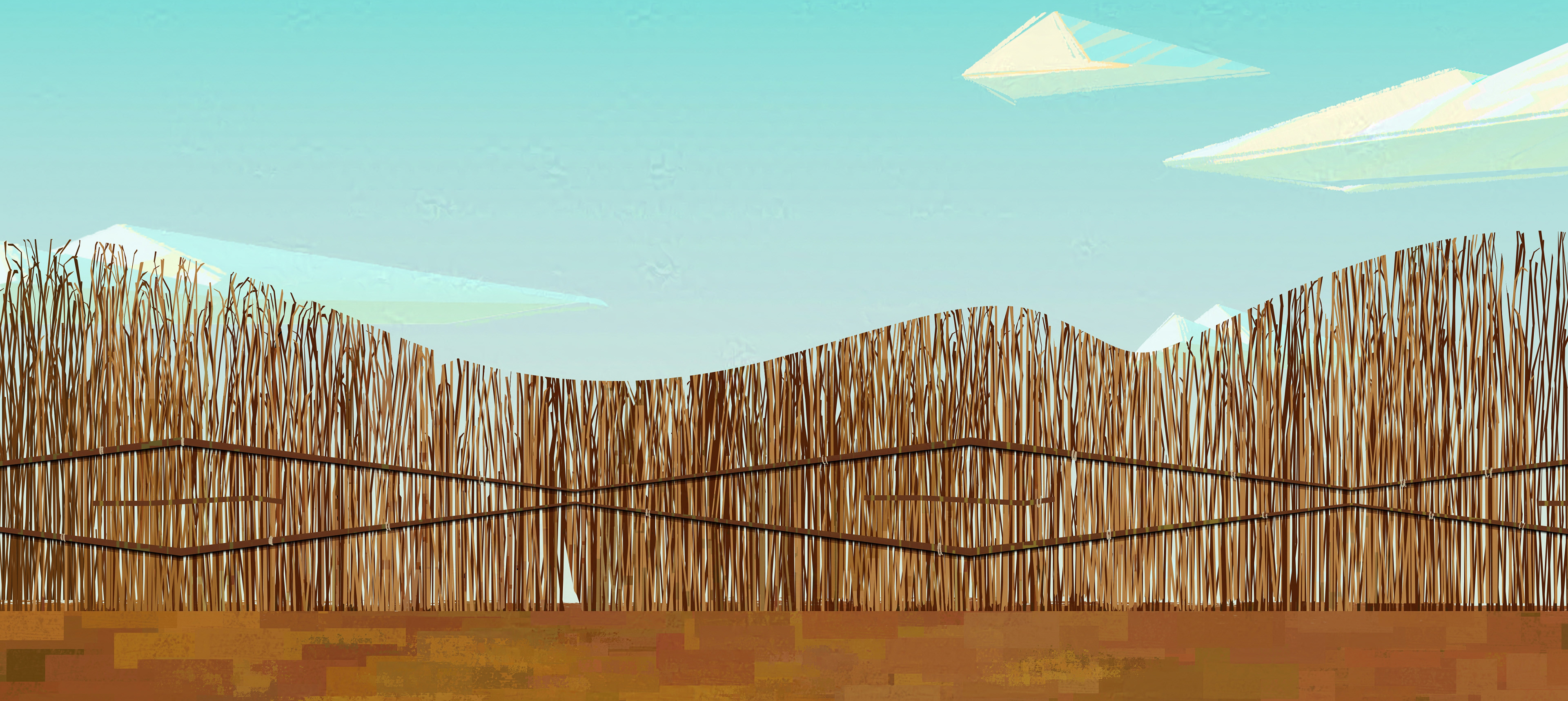
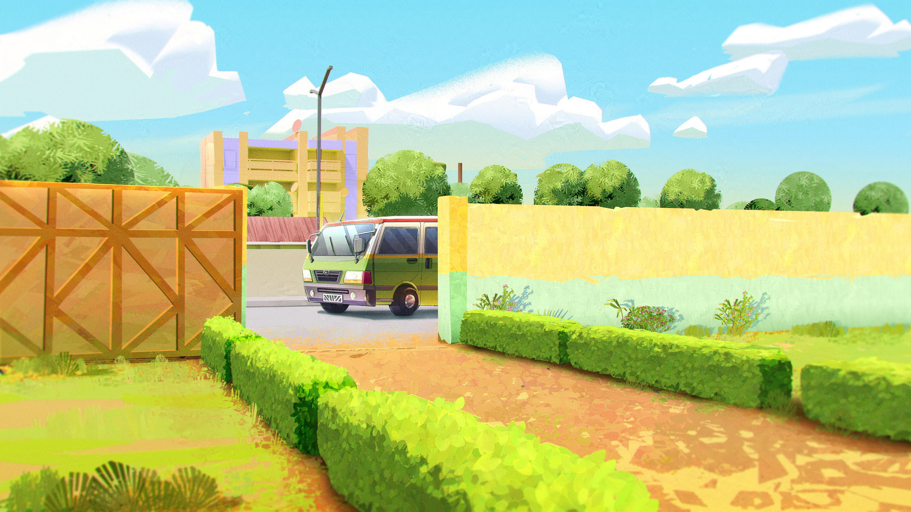
We tried to really push the style even on simple things like fences


One of the many iterations for Magedze drone
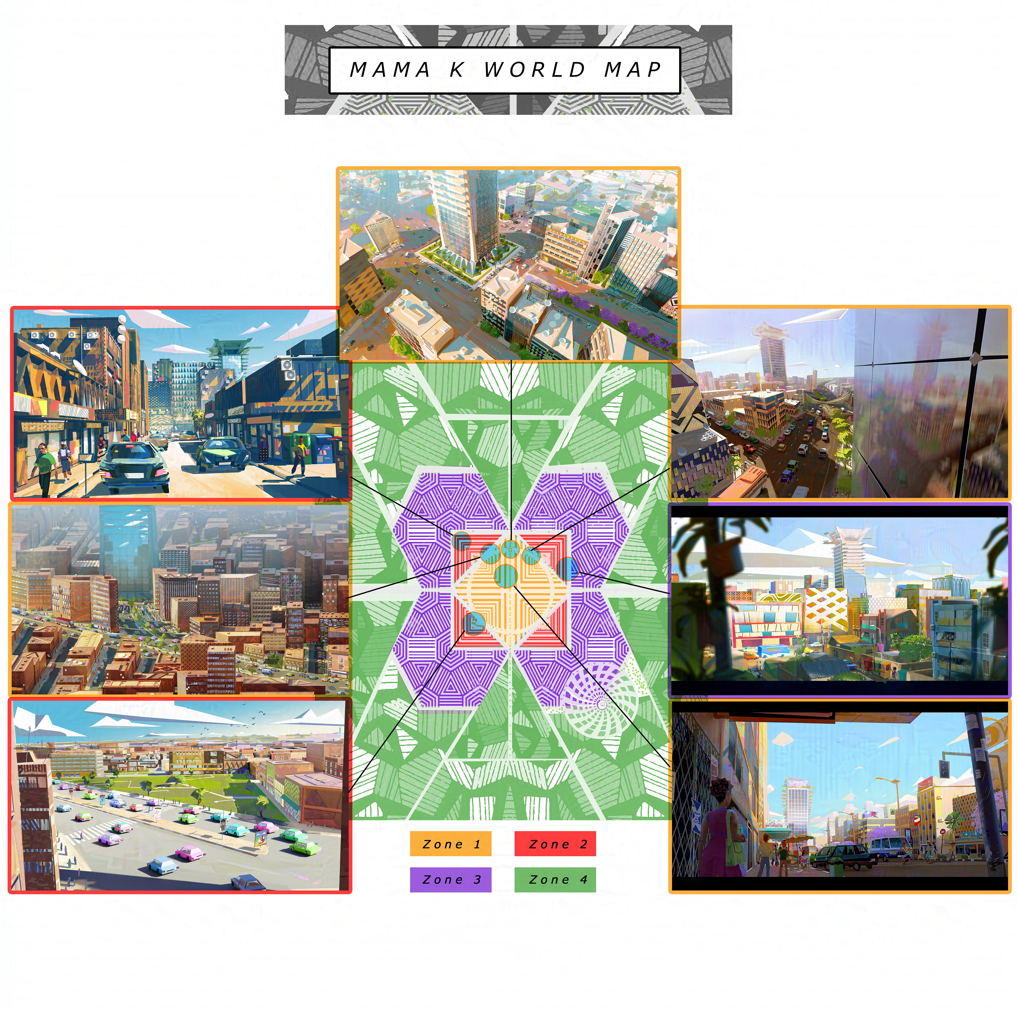
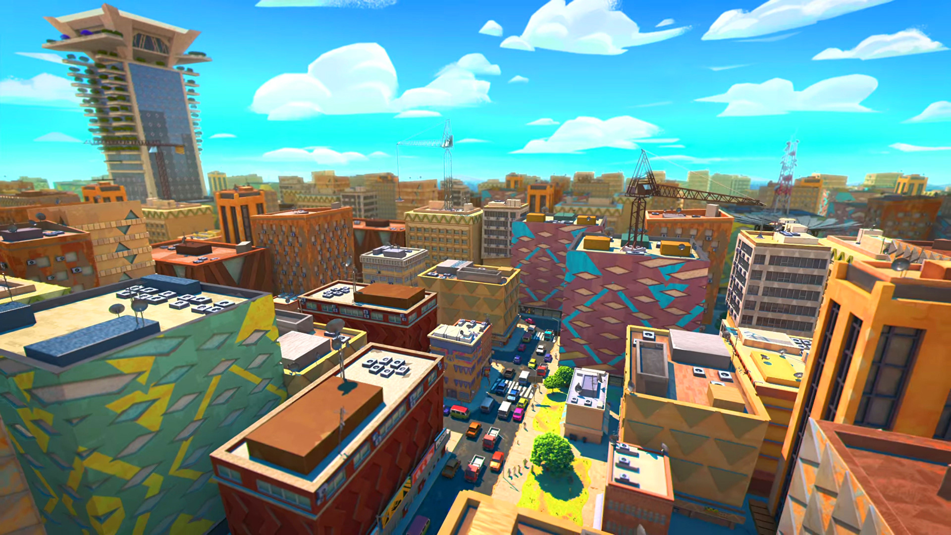
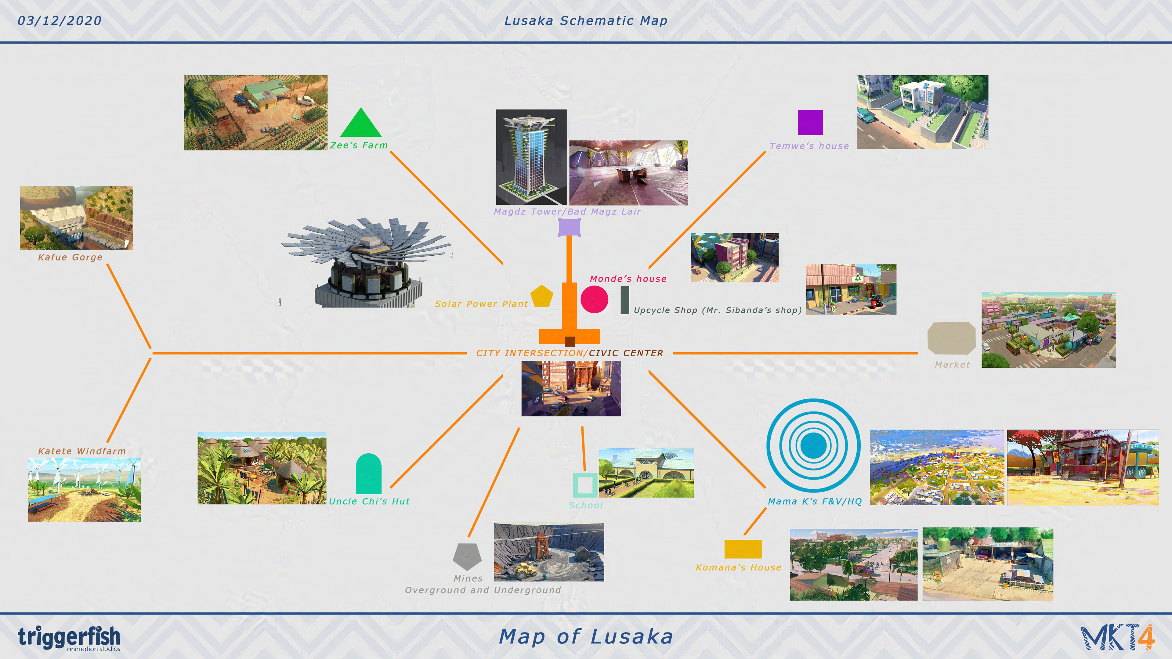
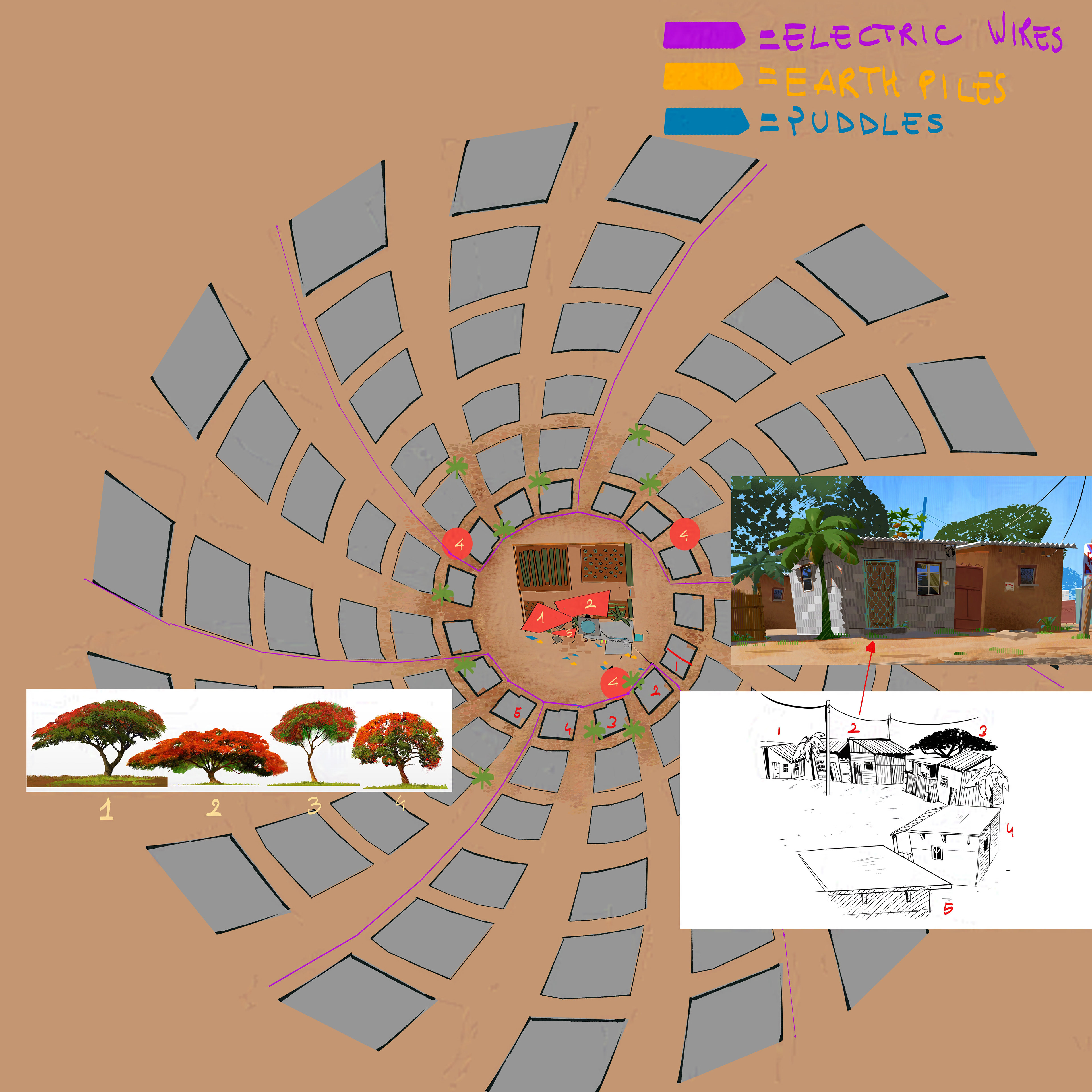
At the beginning the world of Mama K was supposed to be huge, the map above was created to identify different areas of the city. Everything had to look like it was a pattern. Concept art left and right are from Philipe Rios and Mark Tompkins
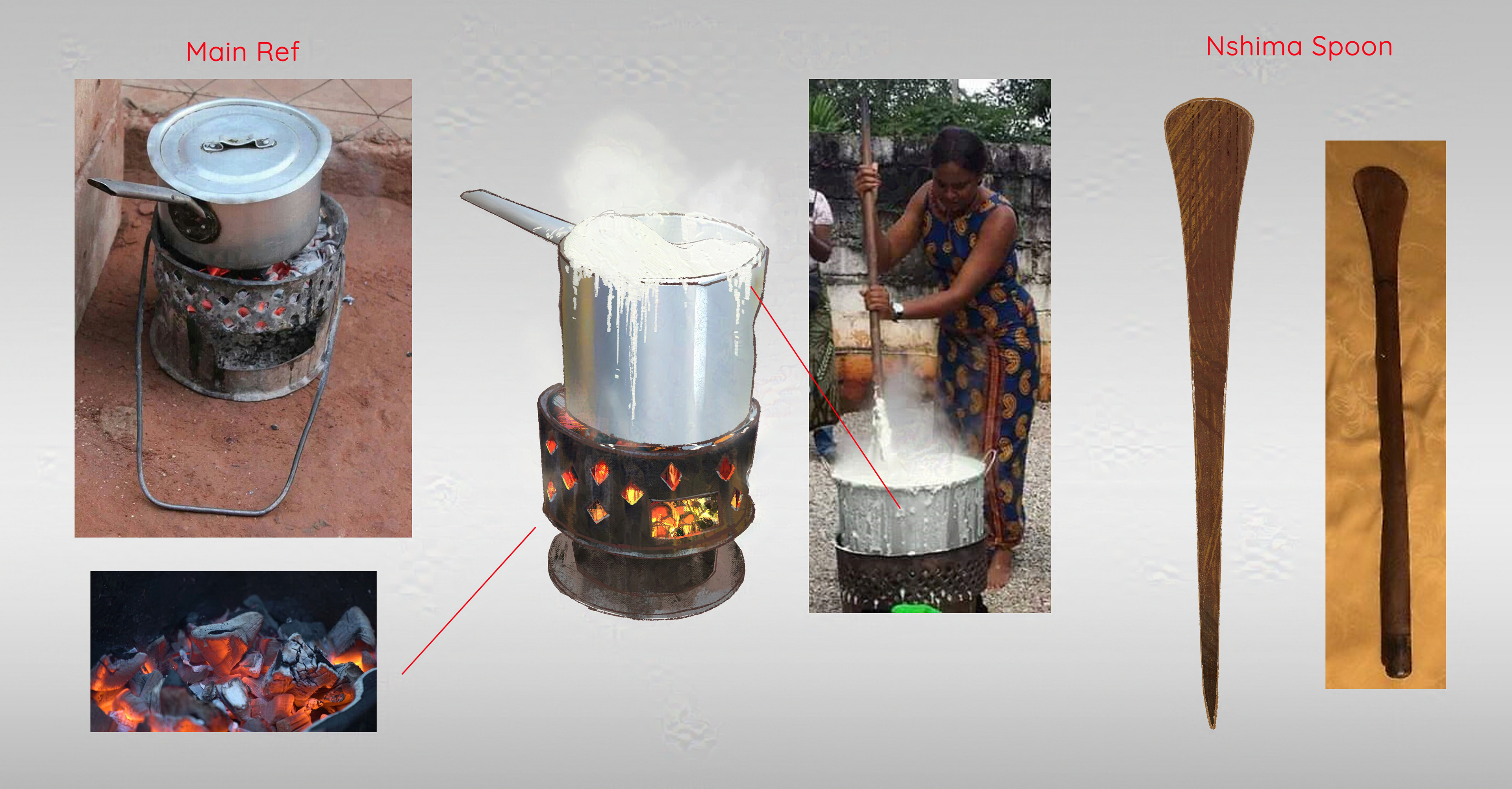
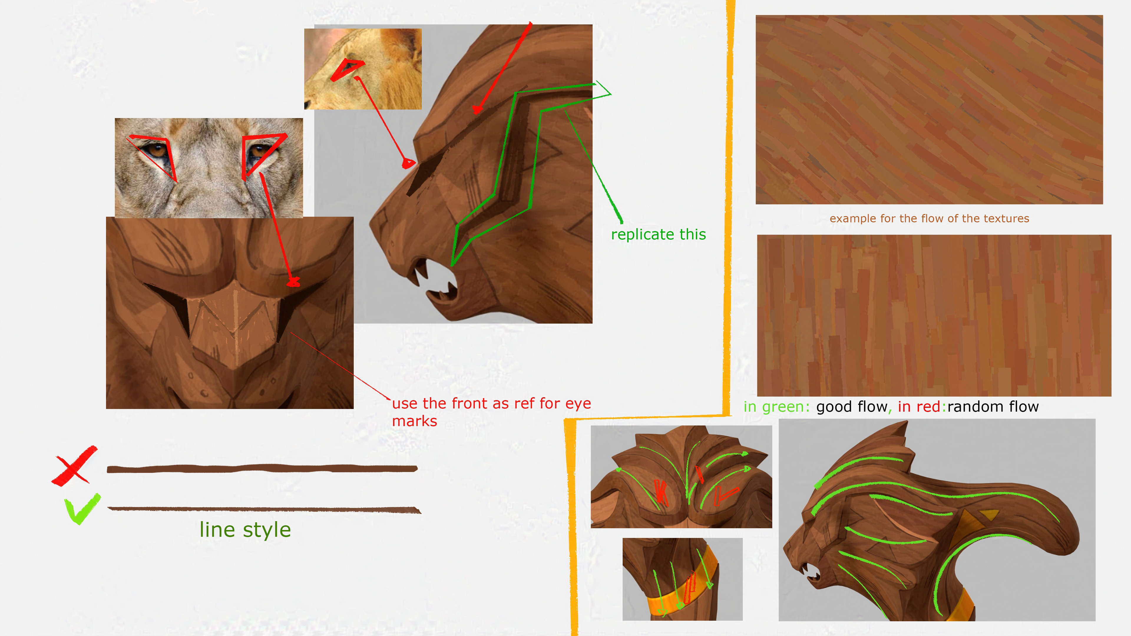
The image above shows the care we had for literally everything in the show even textures. They are all hand painted and specific brushes were created on purpose for each characters and materials.

Some of the concept art was done straight in Blender to speed things up, like the asset above.
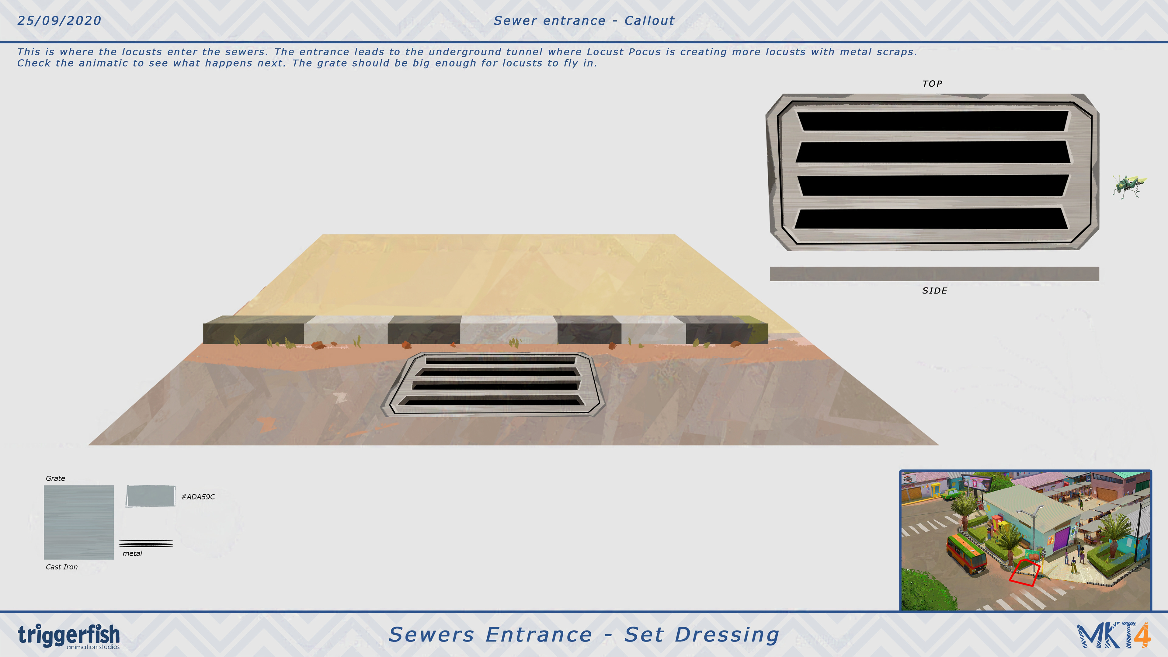
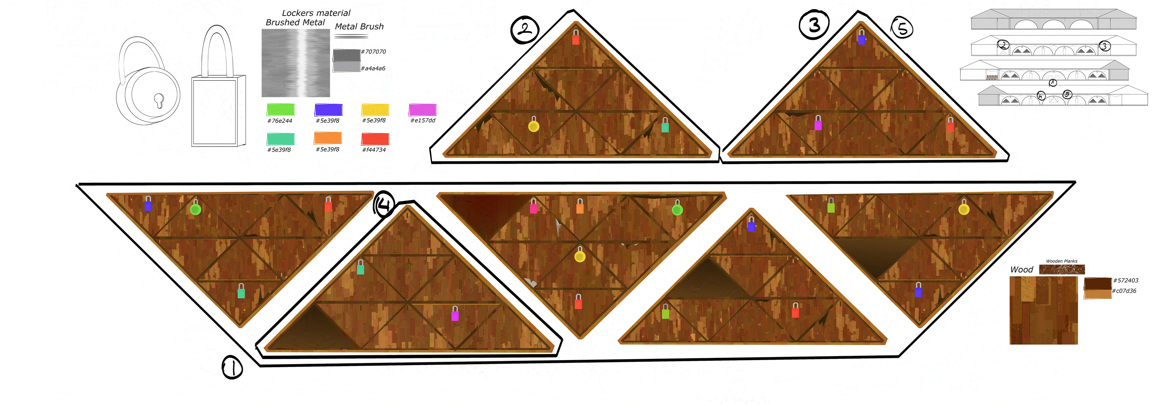
Even a manhole had a "pattern pass" on it. Nothing was left to changce.
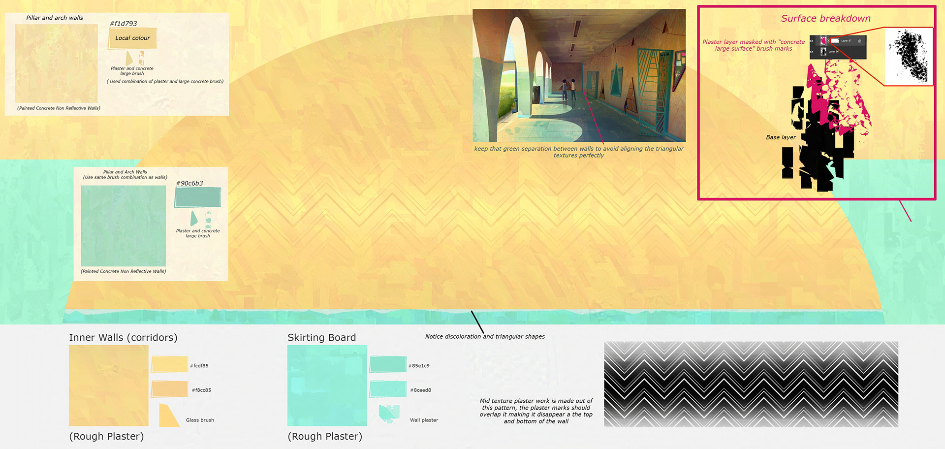
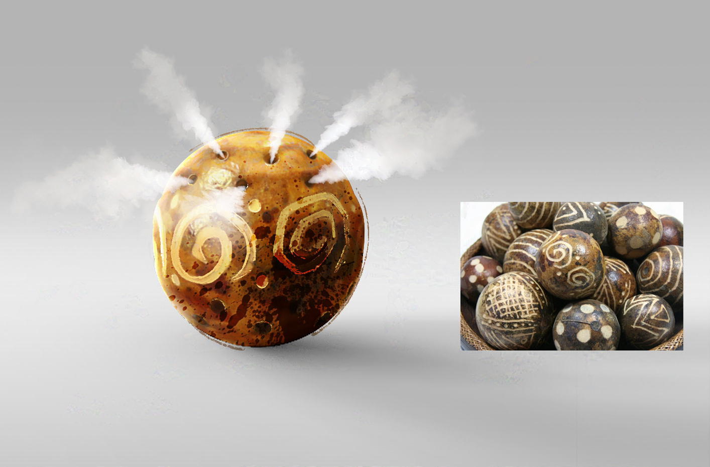
This is another example of textures where created by overlapping different brush strokes and shapes.
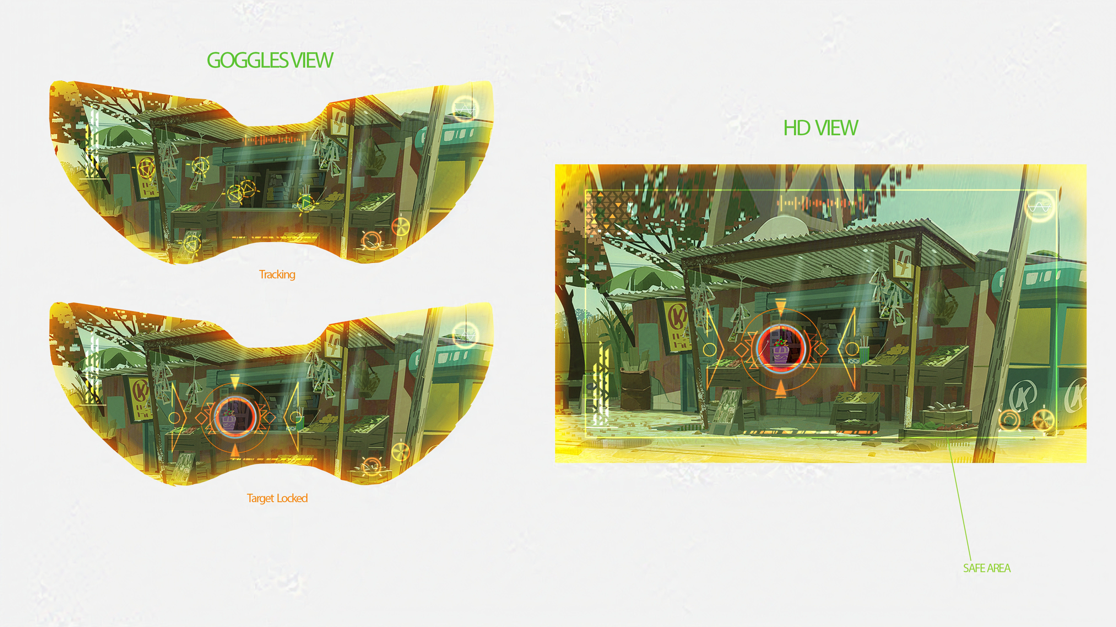
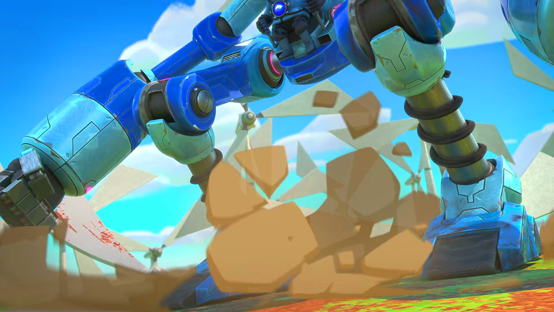
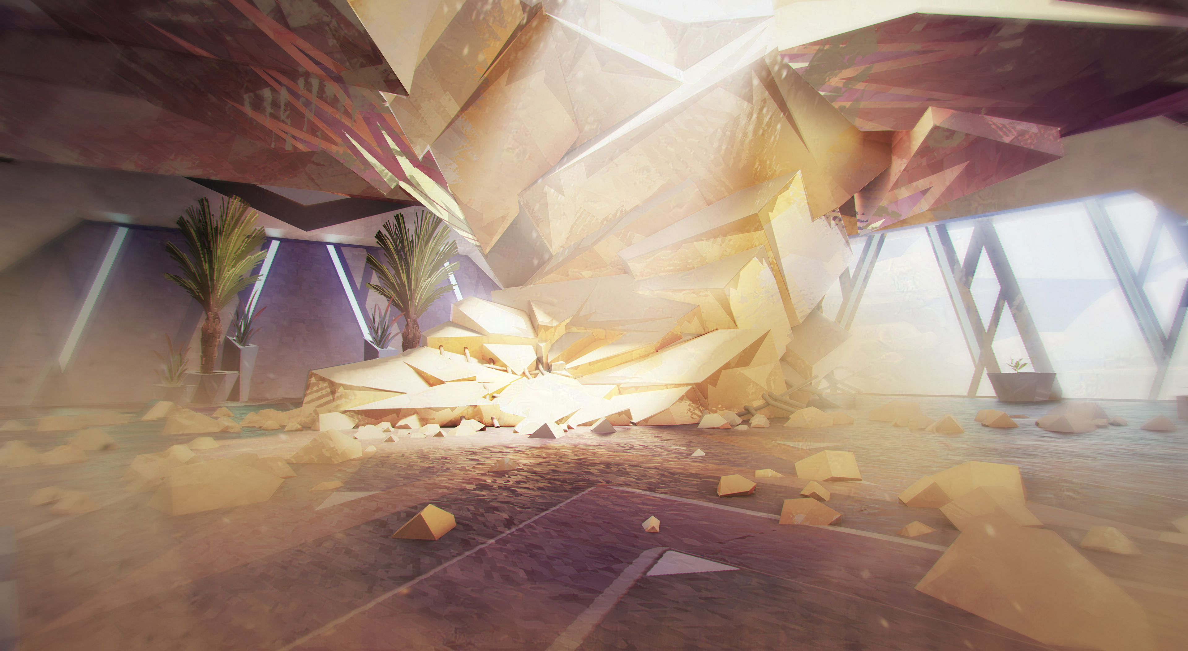
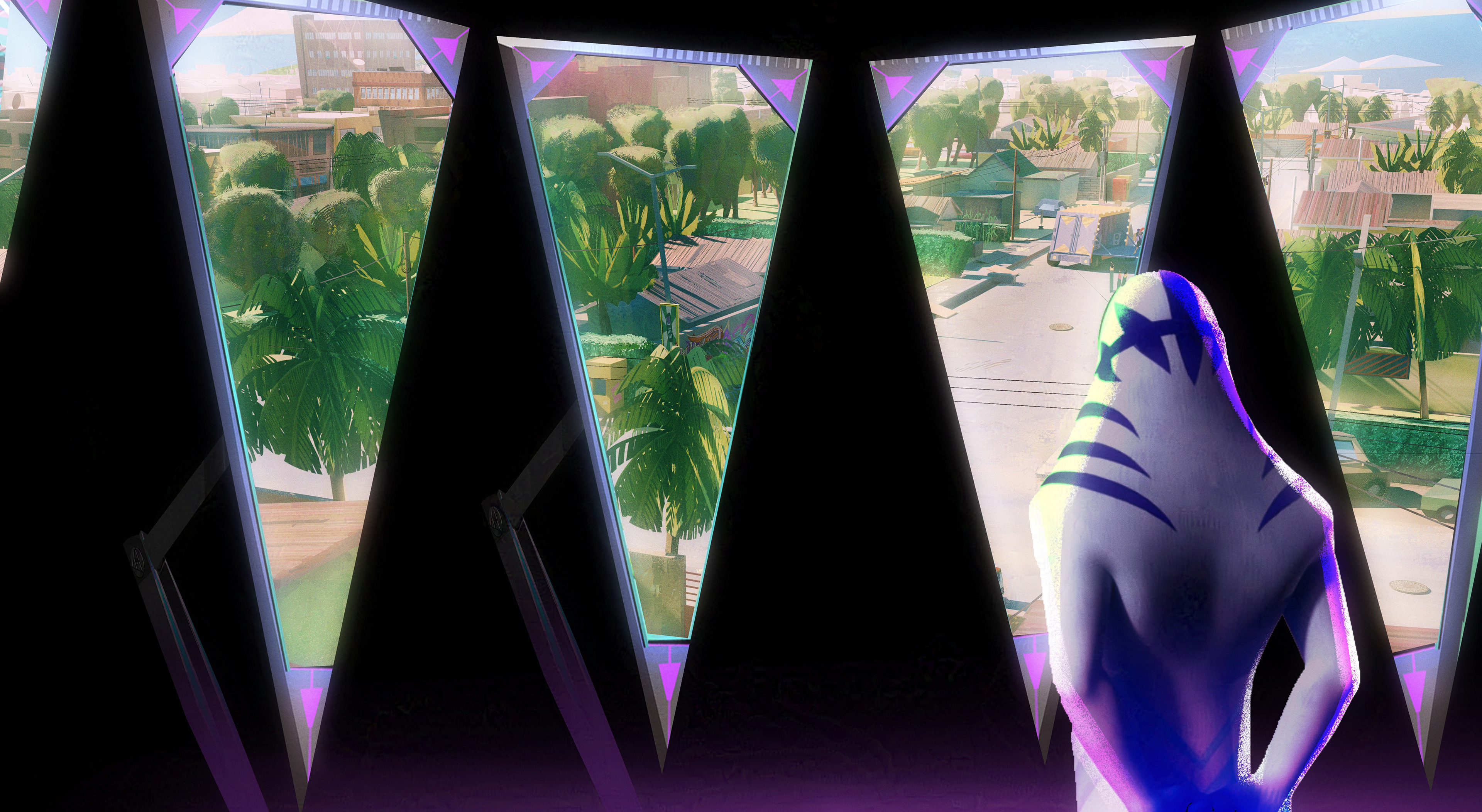
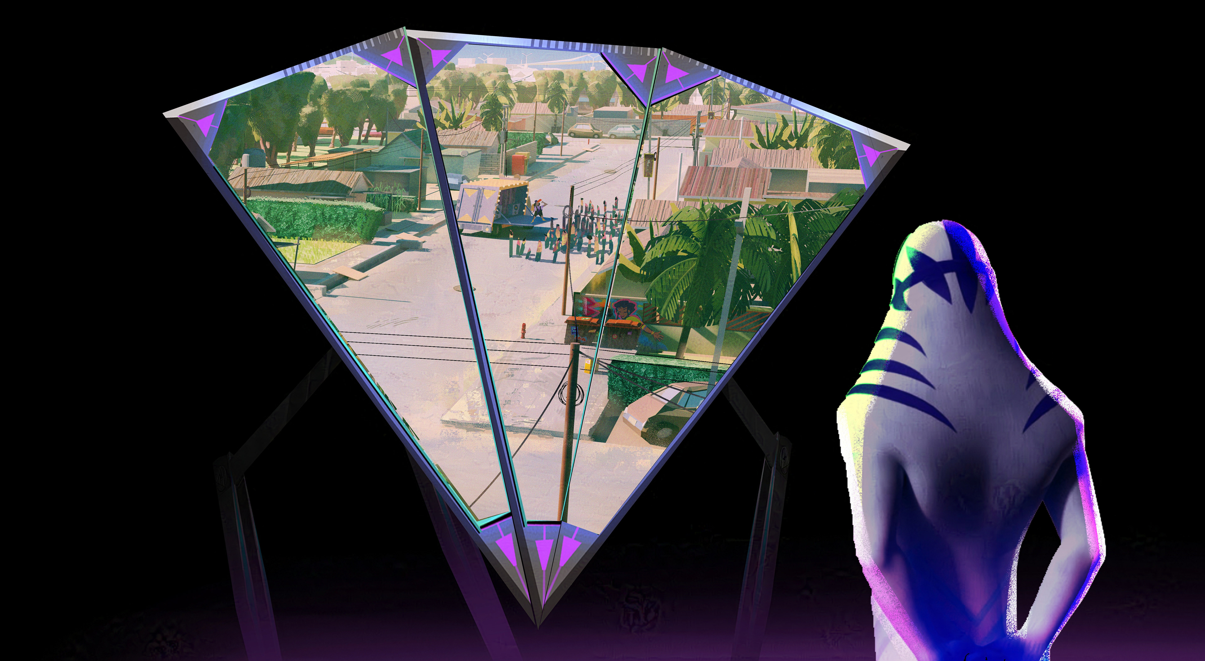
VFX designs were much fun. We tried to instil some high tech here and there but never too much. This is a world were people and our here upcycle where they can. You'll notice what I mean by just looking the first episode.

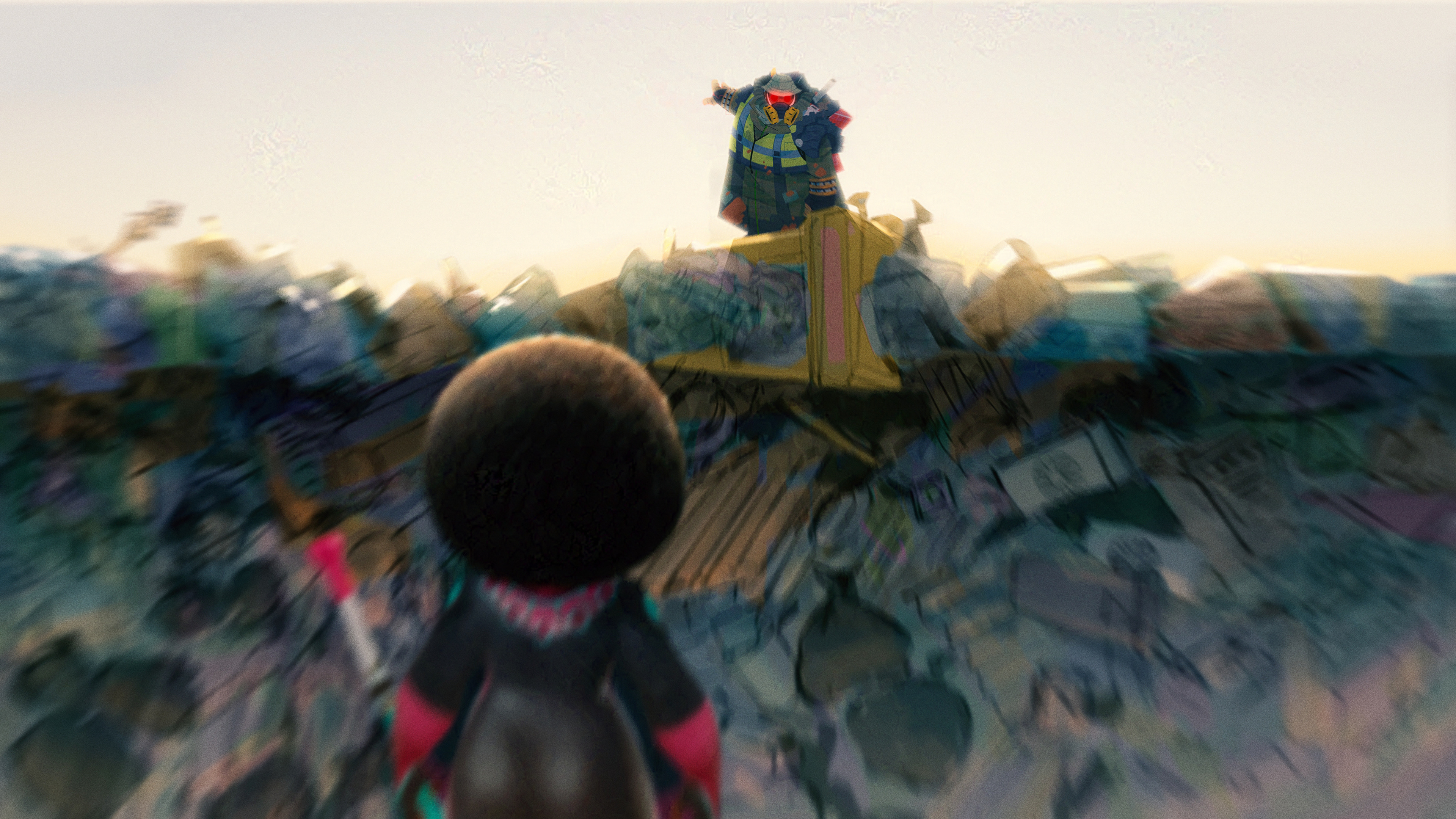
Another fun aspect of the work was to provide possible keyframes and show how some of the characters would do things. In this particular case how the zombie banana trees could attack our heroes.

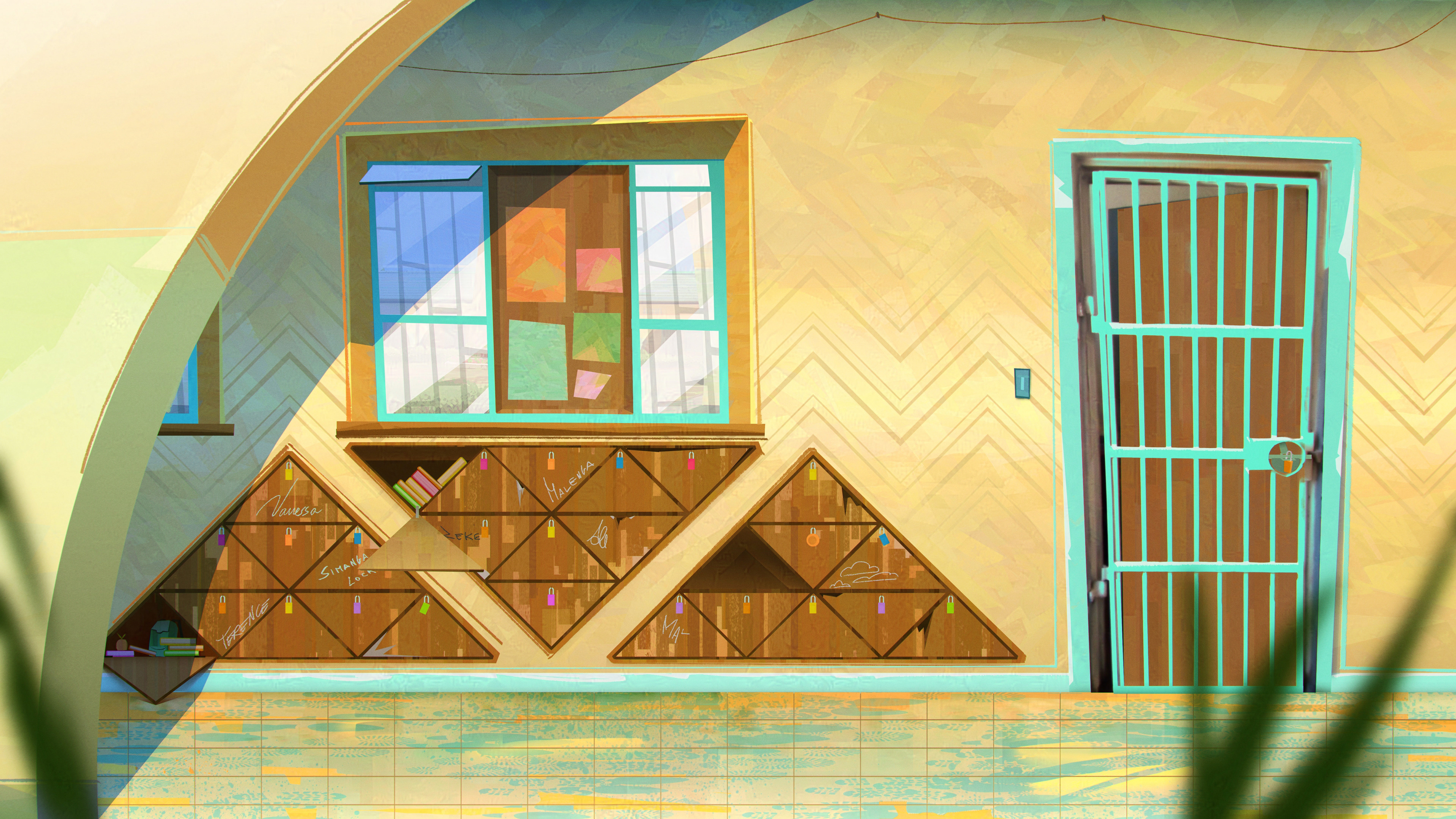
Magedze's floor. I had so many iterations of this, we finally landed on the pattern above. This and what you see in the next images are just an example of patterns where part of everything, even impact shapes!